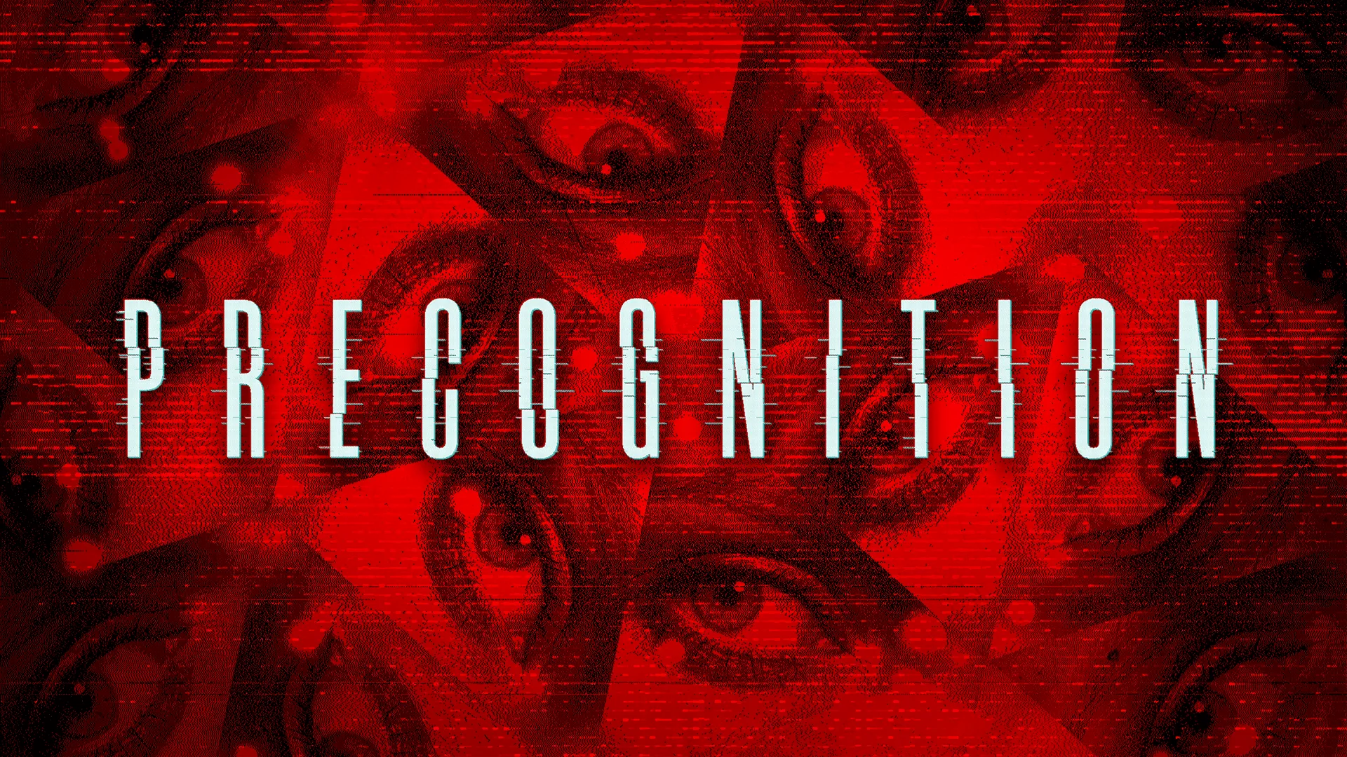
Case Study: Kinetic Games - PRECOGNITION Logo & Key Art

Giving one of Kinetic Publishing’s first games a visual identity

Tag: Content

We’re huge horror game fans here at Project N, so when Kinetic Games, developers of one of the best-selling co-op horror games of all time, Phasmophobia, agreed to monthly work with us, we were pretty excited.

The partnership also gave us a chance to work with Kinetic Publishing, their newly formed publishing arm, and get involved with a whole new crop of indie games.

Their first publishing project was pretty sensational to be involved with, as the new project from Sam Barlow, the creative mind behind Her Story, Telling Lies and IMMORTALITY, his new game arrived with the working title "Project C." Kinetic wanted us to help give the game its first proper visual identity: a logo, key art and title reveal that could introduce the game to the world.

So no pressure then.
EXPLORING THE LOOK

The brief gave us plenty to play with. The game explores ideas around memory, perception and the ripple effects of choices. Sam himself explained how the visual language is built around water, analogue photography, flashes, negatives and the idea of echoes travelling through time.

The direction was deliberately tactile and analogue, rather than glossy sci-fi. He wanted to continue some of the visual quirks found in his previous games, such as bold typography and unexpected arrangements.

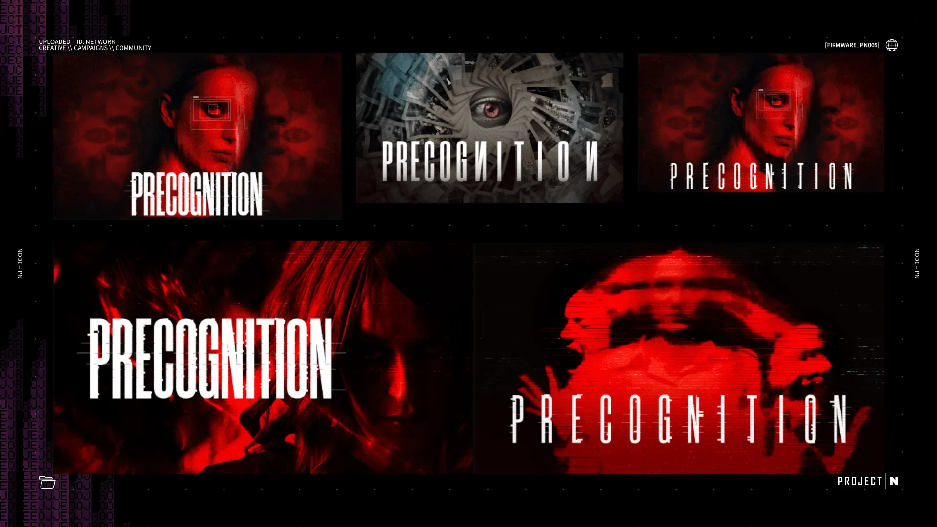
We took all this and explored four different logo and key art directions, looking for something that could feel distinctive enough to show off the game, while leaving room for the mystery.

FROM CONCEPT TO KEY ART

After exploring these different options, it was clear that the second art direction immediately stood out as the favourite.

We set on developing this further to ensure it ticked boxes for everyone at Kinetic Publishing, as well as Sam himself. Luckily, Sam was able to provide additional thoughts for the development, pushing us to emphasise the kaleidoscope aspects of the design, while also refining the smaller elements, such as an additional use of chromatic aberration and the desire to have the work ‘roughened’ up a little more.

With the design for the logo in a near finalised position, the video team pushed on with motion graphics that would reveal the official name of the title. This was achieved with the creation of an asset that showed the placeholder name of "Project C," that then flickered and shifted into the reveal of PRECOGNITION.

The new game was properly revealed in the first ever Kinetic Publishing showcase, appearing right at the end of the show and receiving positive recognition from viewers who saw the reveal live.

We’re incredibly proud to have contributed to this new title and have grown more seasoned in producing branding and key art for new titles.


Project N is an award-winning game agency. We will deliver all your video needs with game trailers and assets. We will tell the best editorial stories. We will design and build your game website. We will create, manage, and grow your game community across Discord and social. We’d love to hear from you. Get in touch now!

Project N’s work on the PRECOGNITION logo and key art was exceptional. They got the brief and understood what we were looking to achieve with the reveal, turning it all around in record time and to a high quality. We couldn’t be happier!
Asim Tanvir - Director of Marketing & Partnerships at Kinetic Games

Fancy working with us? Let’s do this thing...

Get in touch